
Color Trends of 2026
I get nervous talking about 'trends' as a designer… We try not to design trendy homes. We want timeless, elegant, fun. But at the end of the day we do what clients want and we pay attention to what can be sourced at the present time. Remember when everyone painted their homes white and grey? Yeah, we didn't do that if you look at our work! The shift towards warms and blues has been significant since those days- mostly because blues and greens look great with grey...and everyone already had grey everything!
Here is where you want to go and some great groupings that will help you start to put them together- or you can just book us!
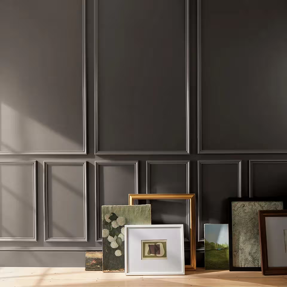
Benjamin Moore: Silhouette AF-655
1. Warm, Rich Neutrals & Earth-Base Hues
Moving away from cool whites and greys toward warmer, richer neutrals.
Think: tobacco brown, sun-baked terracotta, soft charcoal, warm taupe, layered wood tones.
Example palette: Benjamin Moore’s Color Trends 2026 includes hues like Sherwood Tan 1054, Southwest Pottery 048, Silhouette AF-655 (burnt umber with charcoal undertone).
Overall vibe: timeless, grounded, “collected” rather than crisp and minimal.
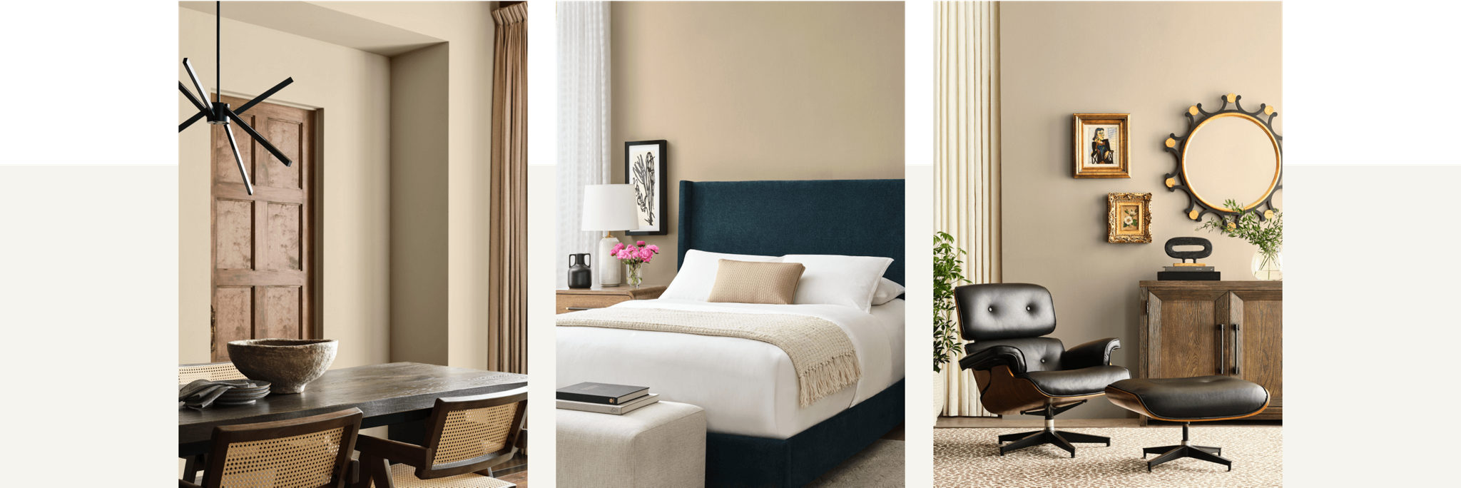
Sherwin-Williams: Universal Khaki
2. Dusty Jewel Tones & Nature-Inspired Depth
Jewel tones are still in, but in muted, dusty, weathered versions.
Muted emerald, deep smoky sapphire, softened amethyst, earthy greens.
Best used on accent walls, cabinetry, built-ins, and key furniture pieces.
3. Color Drenching & Unexpected Pairings
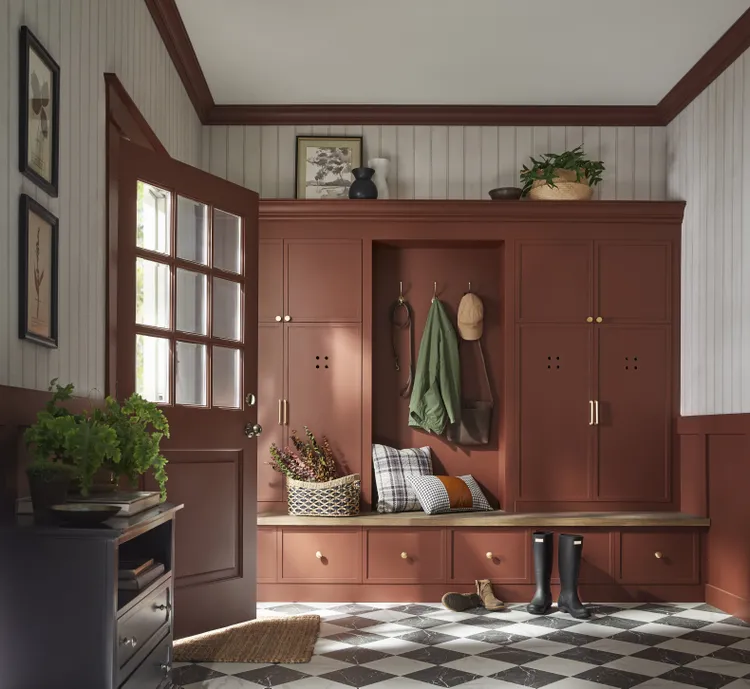
“Color drenching”: walls, ceiling, and trim in the same (or very close) hue to create a cocooning, immersive look. Take a look at our Instagram where we post a house that has lots of dark blue Farrow and Ball Stiffkey Blue color drenching in the office!
Unexpected but balanced pairings: periwinkle + chocolate brown, chartreuse + baby blue, etc.
Great for special spaces (libraries, powder rooms, intimate dining rooms) and dramatic ceiling treatments.
4. Nature-Anchored Greens & Teals
Greens are warming up: herbal, mossy, laurel, eucalyptus tones.
Blue-greens/teals as calming but statement-making choices.
Especially good for indoor–outdoor transitions and spaces that want a connection to landscape and nature.
5. Colors of the Year (Brand Highlights)
Benjamin Moore: Silhouette AF-655 – luxurious burnt umber with charcoal undertones. (the first picture above)
Sherwin-Williams: Universal Khaki – a versatile, warm, grounded neutral. (second set of pictures)
Design Takeaways for you!
Use warm neutrals as the base: Walls and large millwork in warm taupes/soft terracottas to keep spaces timeless and flexible.
Reserve jewel tones for impact: Built-ins, kitchen islands, bars, libraries, and powder rooms in muted emeralds, smoky blues, or deep plum.
Lean into color drenching for drama: Great for moody rooms, home offices, and special ceiling moments. As you can see we have fully embraced this!
Let greens and teals bridge indoor and outdoor: Perfect for our southern projects where natural surroundings matter.
Layer texture with color: Matte paints, velvets, linens, warm metal finishes, and wood tones all help these richer colors feel sophisticated, not heavy.
Quick Palette Ideas to Keep Handy
Warm Taupe + Dusty Sapphire
Walls: warm taupe
Accents: dusty sapphire cabinetry or upholstery
Metals: brushed brass
2. Moss/Teal + Soft Neutral
Cabinetry: moss or teal
Walls: soft, warm neutral
Accents: cream upholstery, black metal details
3. Silhouette + Ivory + OliveBuilt-ins: deep chocolate/charcoal (Silhouette-type shade)
Walls: warm ivory/off-white
Accents: olive and deep green textiles
4. Terracotta + Walnut + ParchmentAccent walls: sun-baked terracotta
Wood: rich walnut
Upholstery: parchment/ivory
Accent: muted amethyst or dusty plum pillows/art